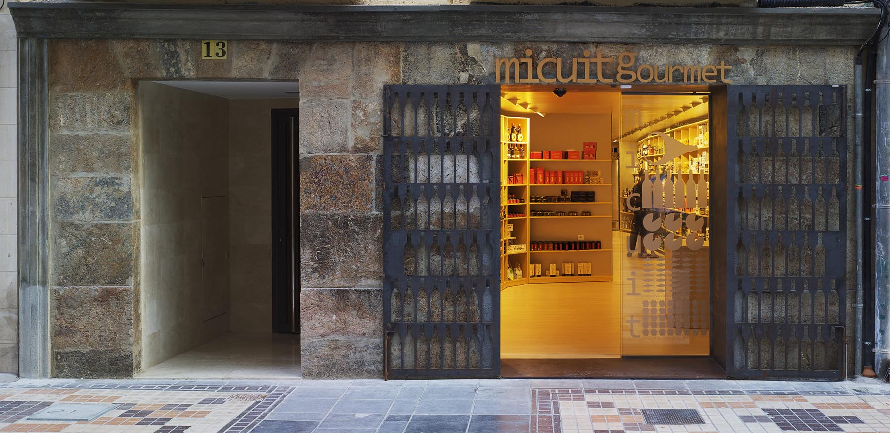
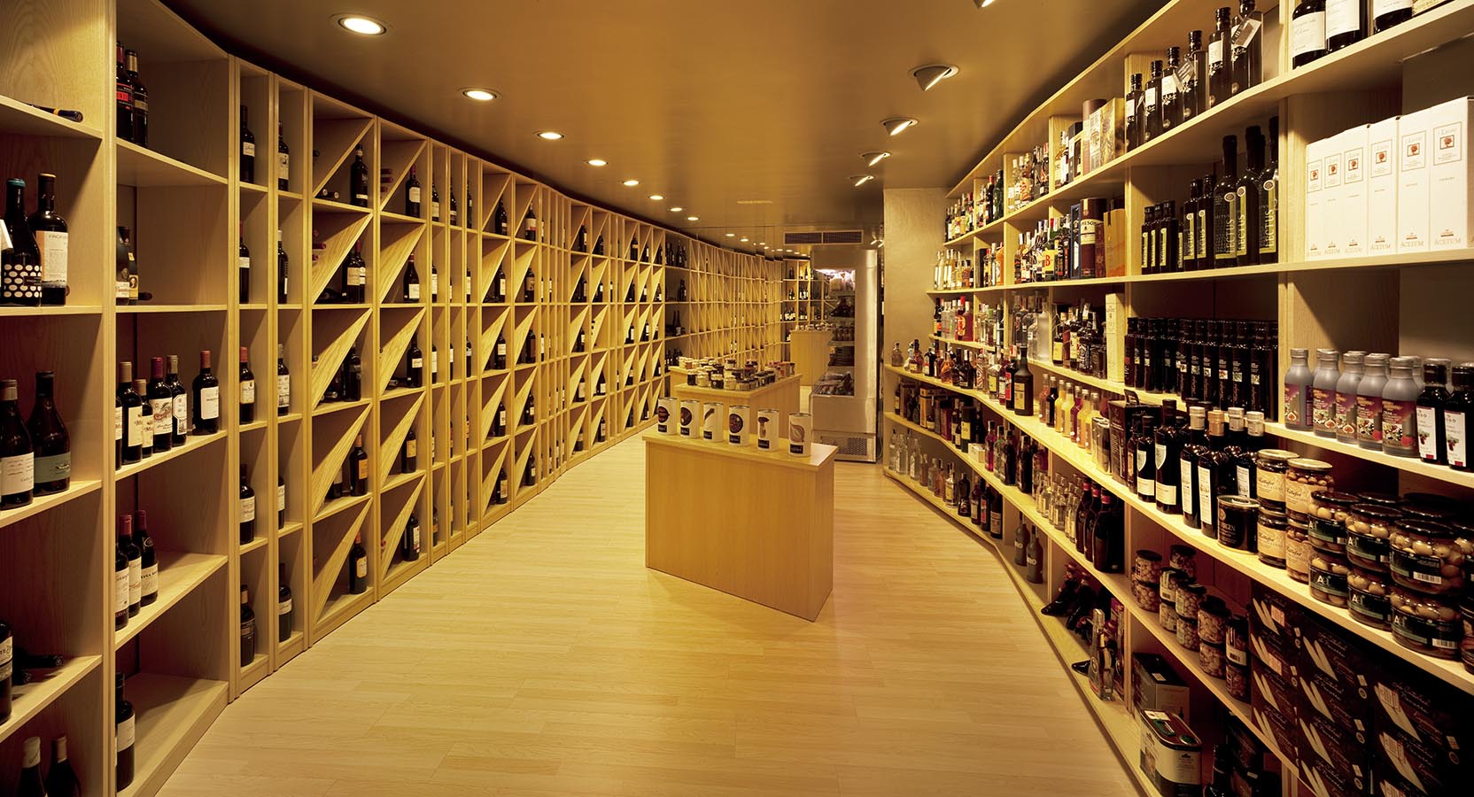
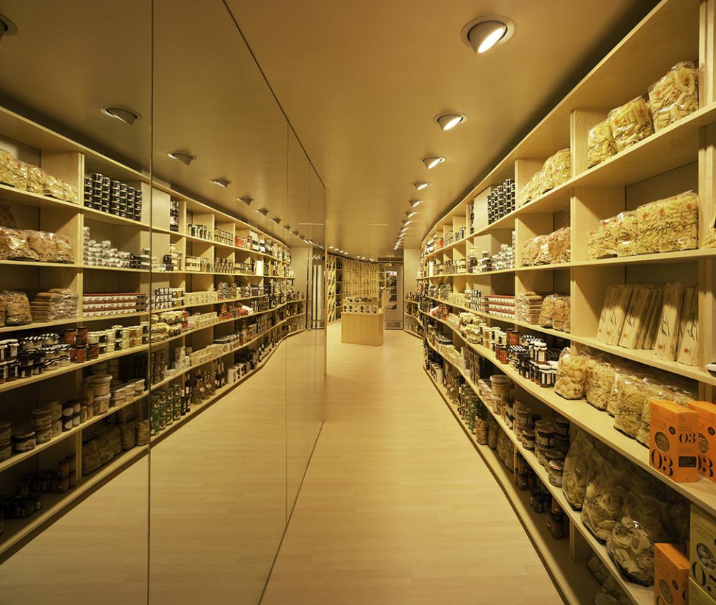
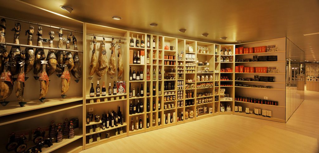
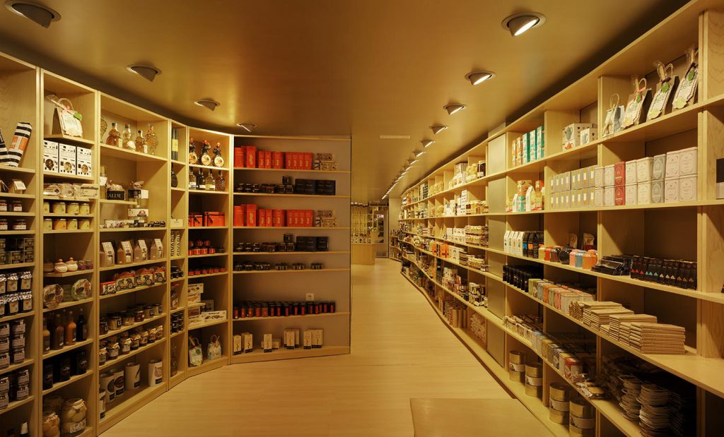
The premises of the adaptation of this small commercial ground floor as a delicatessen shop, are working on its equipment, and taking advantage of the space. We turn storage requirement into an exhibitor element which generates interior space.
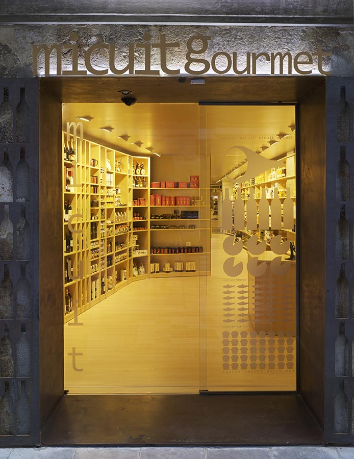
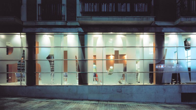
Both, exhibition and storage functions are solved with two different and complementary geometric solutions. The access becomes a shop window: a big door makes the actions of open-close, two totally different situations. The signage and logotypes form the image of the shop and an information filter before you go in.
The main material is the color. Everything is painted with the same tint: storage, ceiling, wall…are golden, and even gold is the color of the logo, bags etc…
In short, this is an exercise of focusing everything in that minimal space. Every element is used and optimized to become a big shop window for the client.

