A tribute to the old taverns in a XXS space
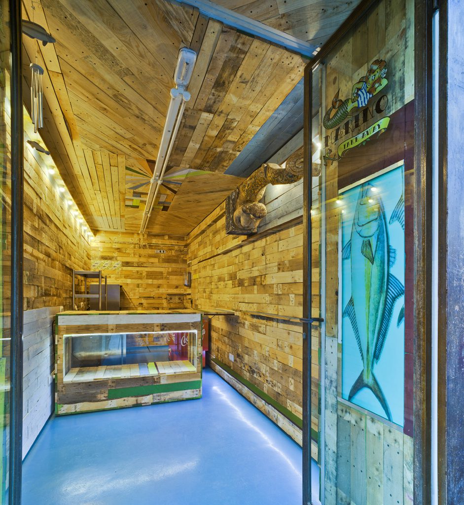
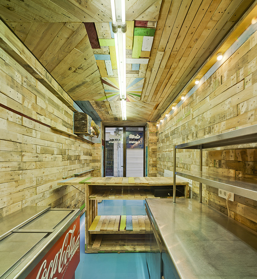
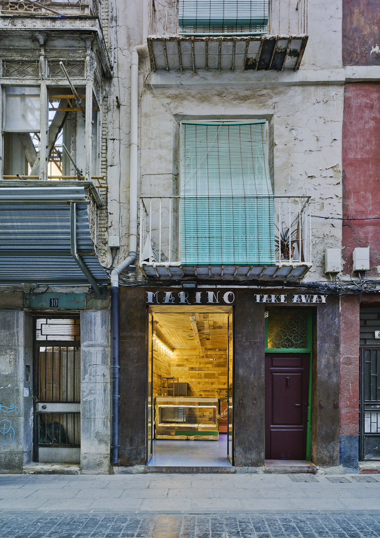
The establishment is located in a ground floor premises with an area of less than eleven square meters of the Aire Street, in the historic center of the city of Cartagena. The aim was to transform the existing space, a small white cube gallery dedicated to art, into a bar and take away retail.
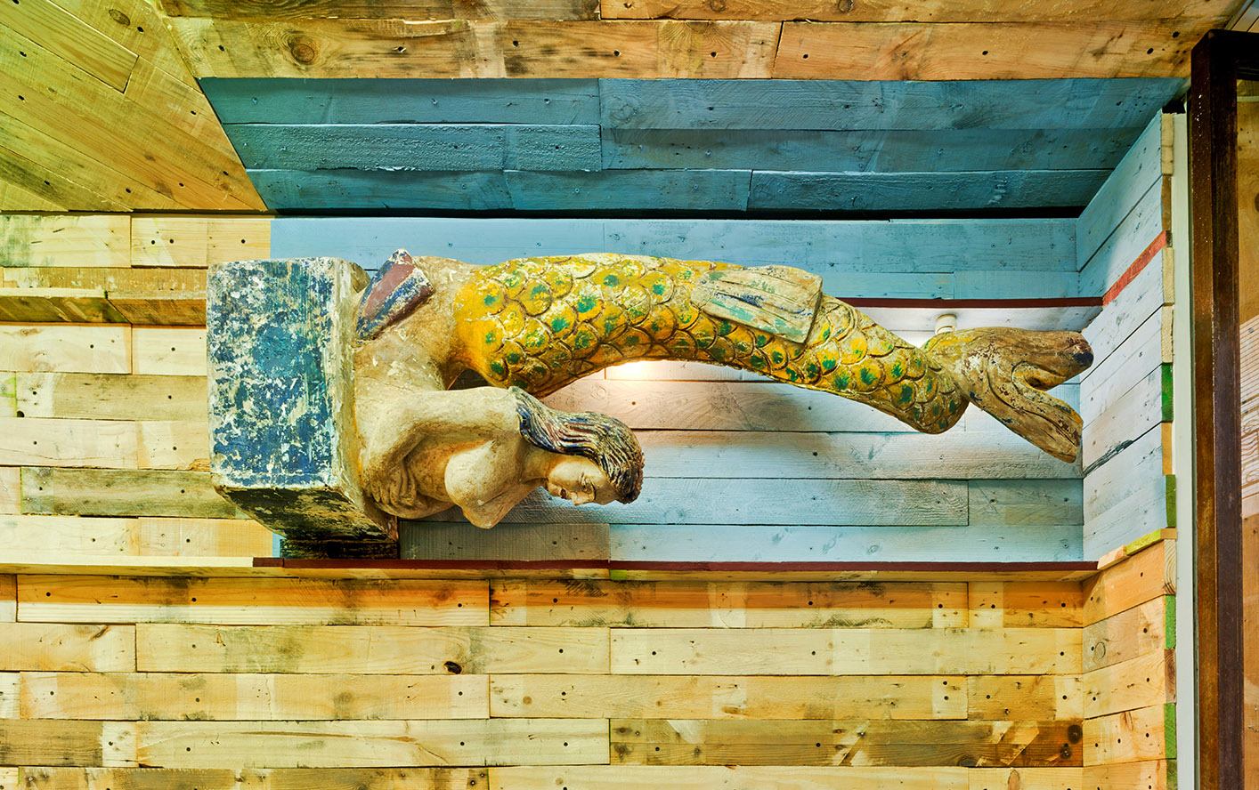
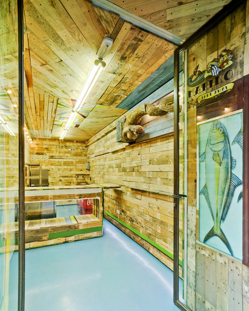
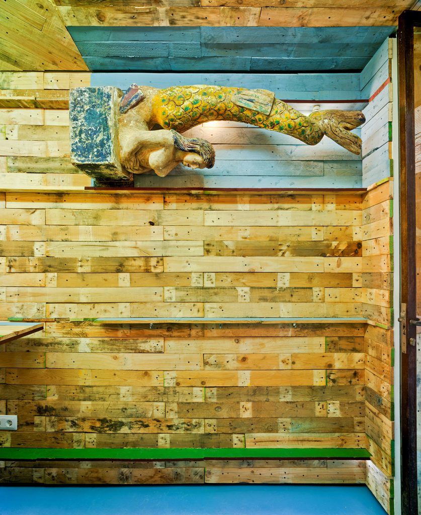
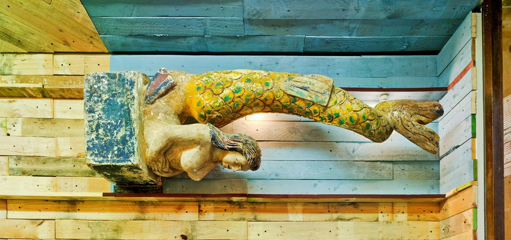
The starting conditions are a quite small space (XXS), a close fitting budget (XXS_$) and an imminent opening date (XXS_min); the intervention is projected with these data. The products for sale -fish beeing the star-, the name of the place “Marino”, the delicate logo by Angel Charris, and the nearby presence of the port, invited us to make with the small room a tribute to the old-port city taverns.
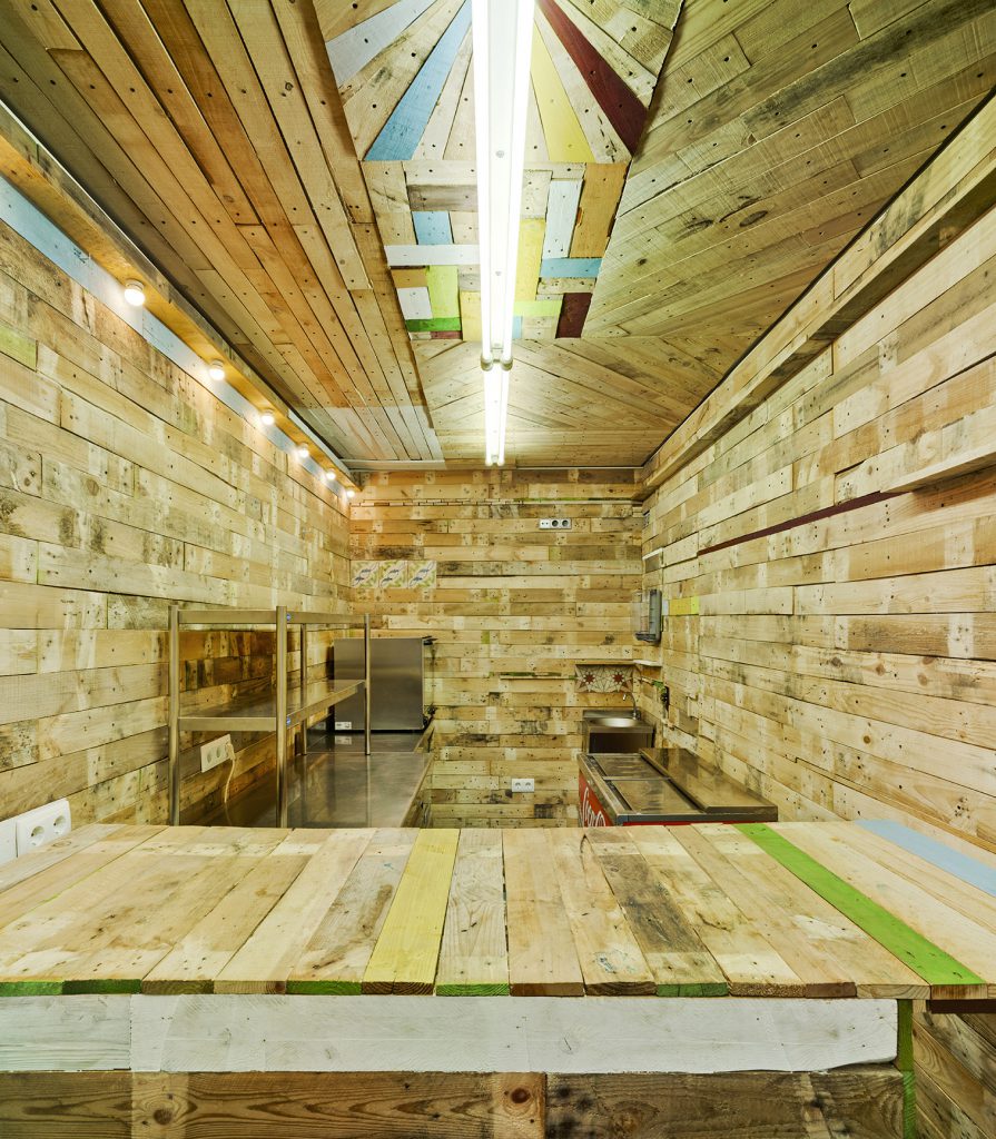
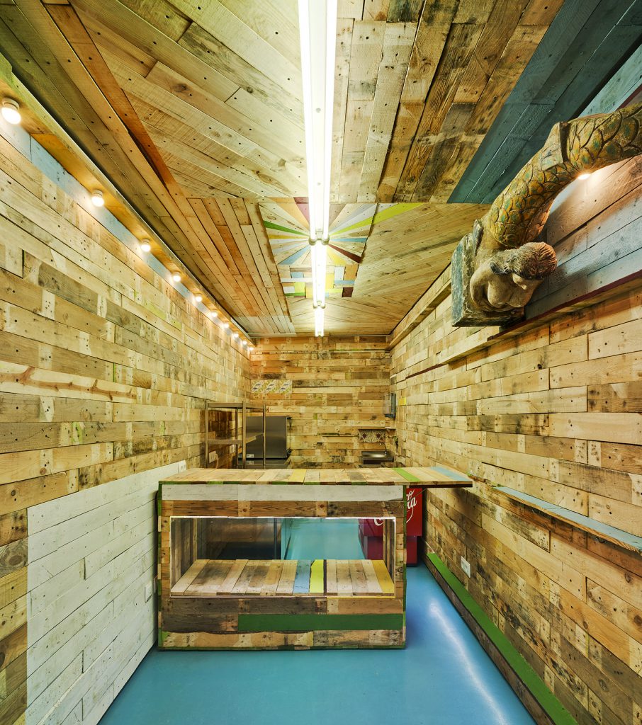
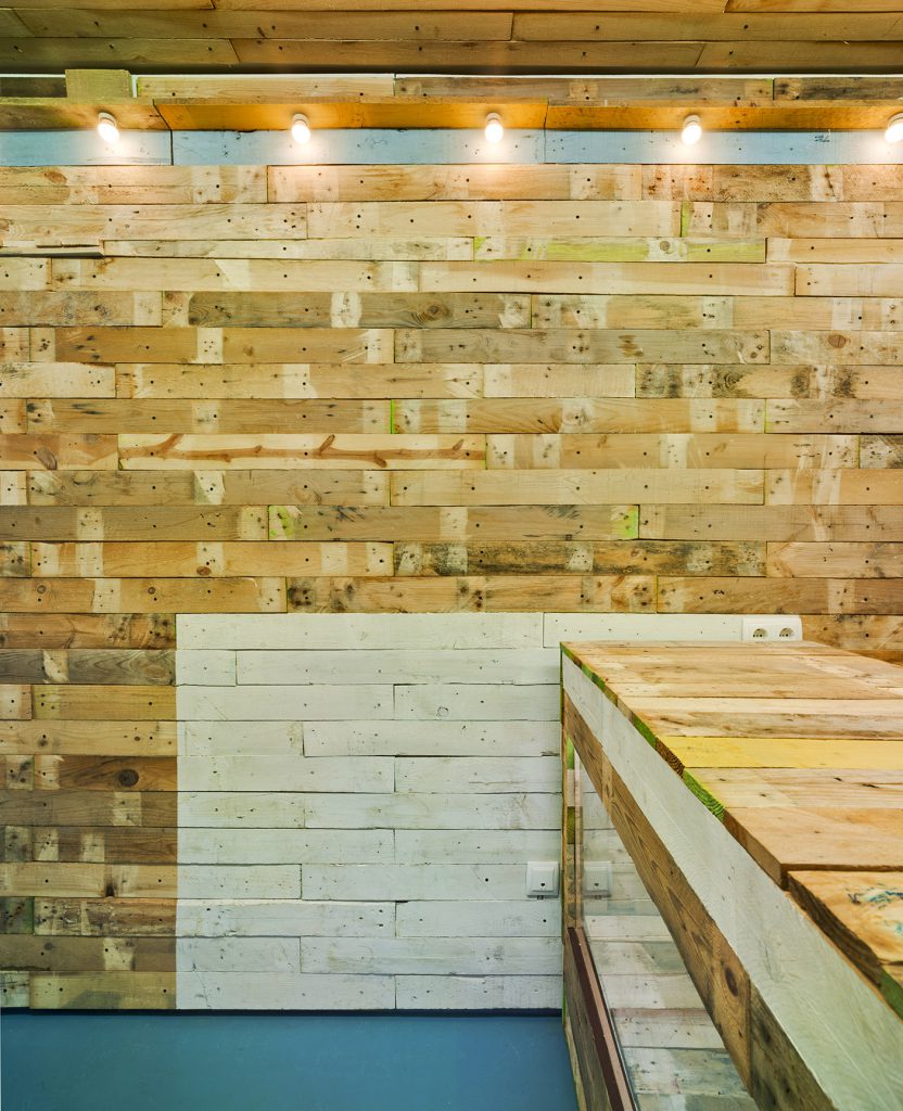
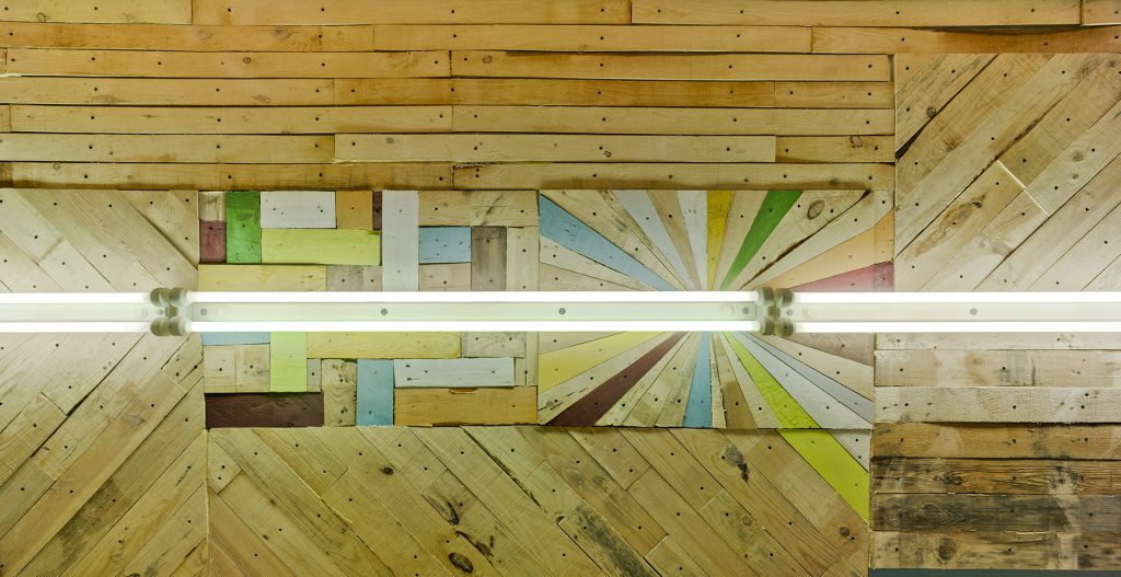
The wooden planks covering the entire surface, the colour as the distributor of space, and light as a generator of a changing atmosphere throughout the day, are the constructive materials of the project. From these decisions, the usage of reutilized elements allows the project to fit the budget: the existing walls are the direct support of the coating, the wood planks are removed parts from recycled pallets, samples of laminated glass are used from previous work rests (the glassware printed with fish), ancient ceramic tiles are recovered from the original building, and the old inherited strip of white light is integrated in the new.
The resultant continuous surface from walls to furniture, is rough, worn and dirty, but vibrant, for the rithm of the planks position, dimension and texture, shows up in a composition of bands and coloured lines that orders and marks out the painted place. A new line of light bulbs is added to emphasize tones and textures.The planks of wood are bolted to the plates of existing plasterboard, facilities and connections will be hosted in its backfill. The arrangement of all the equipment needed for the activity, achieves to maximize the space, creating different areas. For the interior lighting, general daylight atmosphere provided by the central strip line, is combined with low intensity yellowed light that puts in the theatrical accent.
Finally, the pavement is set with a continuous surface of blue latex paint. Outside, the entry doors with rusty steel profiles integrates into the facade of the same material, establishing a consistent relationship with the natural aspect of the other materials and letting the new tavern’s nature speak out.
One of the first customers asked at the entrance:
– Is this Far West, Dad?

